
Mobile-First Web Design: Why It Matters Most in India in 2026
Introduction
India is now one of the most mobile-driven digital markets in the world, making Mobile-First Web Design more important than ever. A majority of internet users in India access websites primarily through smartphones, especially in Tier 2 and Tier 3 cities where mobile usage continues to grow rapidly. Despite this shift, many business websites are still designed mainly for desktop users, leading to slow loading times, poor navigation, and frustrating mobile experiences.
In 2026, Mobile-First Web Design is no longer optional for businesses that want to compete online. Google prioritizes mobile-friendly websites in search rankings, and users expect websites to load quickly and work smoothly on smaller screens. A website that performs poorly on mobile devices risks losing traffic, leads, and sales to competitors with better user experiences.
Mobile-First Web Design focuses on creating websites specifically for smartphone users before adapting them for larger screens. This approach improves usability, SEO performance, and customer engagement. In this guide, you will learn why Mobile-First Web Design matters so much in India and how businesses can use it to create faster, more effective websites in 2026.

India’s Mobile Internet Reality in 2026
India’s internet landscape has changed dramatically, making Mobile-First Web Design essential for every business in 2026. Millions of new users have come online in recent years, and most of them access the internet exclusively through smartphones. For many people across Tier 2 and Tier 3 cities, a mobile phone is their primary and often only digital device.
This shift has completely transformed user expectations. Indian users are now accustomed to the fast, smooth experiences delivered by apps like WhatsApp, YouTube, Swiggy, and Meesho. As a result, users expect websites to load quickly, display properly on smaller screens, and be easy to navigate with one hand.
When websites ignore Mobile-First Web Design, visitors often face tiny buttons, unreadable text, slow loading pages, and layouts that require zooming or horizontal scrolling. Most users leave within seconds when this happens.
That is why Mobile-First Web Design is no longer just a design trend. It is a critical strategy for improving user experience, engagement, SEO performance, and conversions in India’s mobile-driven digital market.
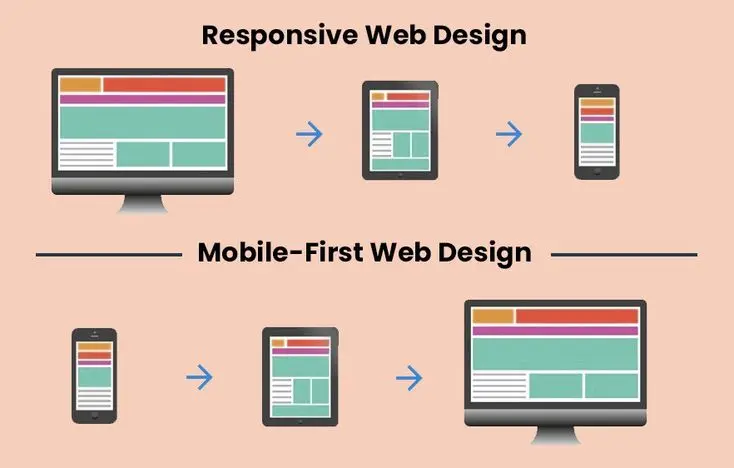
Mobile-First vs. Mobile-Responsive: What’s the Difference?
Many Indian web designers and business owners often use “mobile-responsive” and “Mobile-First Web Design” interchangeably, but these are fundamentally different approaches.
A mobile-responsive website starts as a desktop design and is later adapted for smaller screens using CSS breakpoints. It treats mobile as an afterthought. Mobile-First Web Design flips this process entirely the smallest screen is designed first, then progressively enhanced for tablets and desktops.
This distinction has a direct impact on user experience. Because Mobile-First Web Design begins with the constraints of a small screen, every element navigation, buttons, content layout is intentionally built for touch interaction, thumb-reachable placement, and fast loading on slower mobile networks like those commonly used across India.
With responsive design, mobile users often receive a compressed version of a desktop experience. With Mobile-First Web Design, desktop users receive an expanded version of an already optimised mobile experience a far more efficient and user-friendly outcome.
For Indian businesses targeting audiences who primarily browse on smartphones, choosing Mobile-First Web Design over a basic responsive approach isn’t just a technical preference. It’s a strategic decision that directly affects engagement, bounce rates, and conversions.
What Mobile-First Web Design Looks Like in India
- Touch-friendly tap targets: All buttons, links, and interactive elements must be at least 44×44 pixels to be comfortably tappable without precision. Many Indian websites have tiny navigation links that are virtually impossible to tap accurately on a smartphone.
- Single-column layouts: The primary content flow should be a single readable column on mobile, not multiple columns that squeeze illegibly on small screens.
- Optimised for 4G and variable connections: Indian mobile speeds vary dramatically, especially in Tier 2 and 3 cities. Mobile-first design means aggressive performance optimisation, including compressed images, lazy loading, and minimal JavaScript, so the site works well even on slower connections.
- Thumb zone design: The most important interface elements, the primary CTA, navigation, and contact buttons should be within comfortable thumb reach (the bottom 60% of the screen on standard smartphones). Navigation menus placed at the top of a mobile screen are out of thumb reach for most users.
- Minimal form fields: Indian mobile users abandon forms aggressively. Every form field that is not strictly necessary should be removed. Use phone number OTP verification instead of email-password registration where possible it reduces friction dramatically for the Indian market.
- WhatsApp integration: For Indian SMEs, a WhatsApp click-to-chat button is often more effective than a contact form. Indian users trust and prefer WhatsApp communication integrating it directly into the mobile website design is a conversion-rate multiplier.

Google’s Mobile-First Indexing and Why It Matters
Since Google fully shifted to mobile-first indexing, the way websites are evaluated for search rankings has fundamentally changed. In this system, Google’s crawler primarily uses the mobile version of a website’s content for indexing and ranking purposes. This means that the mobile experience is no longer a secondary consideration; it is the main version that determines how your site performs in search results.
As a result, your desktop website plays a far smaller role in SEO performance compared to your mobile site. If your mobile version has missing content, slow loading speed, poor layout structure, or broken functionality, your rankings can drop significantly even if your desktop version is visually perfect and fully optimized. This shift has made performance, usability, and content consistency on mobile devices absolutely essential.
This is where Mobile-First Web Design becomes a critical strategy rather than just a design preference. With Mobile-First Web Design, websites are built starting from the smallest screen first and then scaled up for larger devices. This approach ensures that core content, navigation, and performance are optimized for mobile users from the beginning, rather than being adjusted later as an afterthought.
Because Mobile-First Web Design prioritizes speed, readability, and intuitive navigation, it naturally aligns with what Google’s mobile-first indexing system rewards. Faster load times, clean layouts, properly structured content, and touch-friendly interfaces all contribute to improved search visibility and better user engagement.
For Indian businesses competing in increasingly crowded digital markets, adopting Mobile-First Web Design is especially important. Whether targeting local customers or national audiences, a mobile-optimized website ensures better rankings, lower bounce rates, and higher conversion potential. In today’s SEO landscape, success is no longer about having a strong desktop site it’s about delivering a seamless mobile experience that satisfies both users and Google’s ranking algorithm.
Essential for Local SEO and Indian Businesses
In the Indian digital landscape, Mobile-First Web Design plays a crucial role in determining how effectively businesses attract and convert local customers. Today, most local search activity happens on smartphones, where users are looking for quick, immediate solutions rather than browsing extensively. Whether someone is searching for a “plumber near me,” a nearby clinic, a restaurant, or a beauty salon, the decision-making process is fast and highly intent-driven.
These “near me” searches have grown significantly in India due to widespread smartphone usage and improved internet accessibility. Users expect instant results, clear business information, and easy ways to take action, such as calling, booking, or getting directions. If a website is not optimized for mobile devices, it becomes difficult for users to engage, leading to higher bounce rates and lost business opportunities.
This is where Mobile-First Web Design becomes a powerful advantage. By prioritizing mobile users first, websites are built to deliver fast-loading pages, simplified layouts, and intuitive navigation that works perfectly on smaller screens. Instead of shrinking a desktop site to fit mobile, Mobile-First Web Design ensures that essential content such as contact details, services, pricing, and location is immediately accessible without unnecessary scrolling or confusion.
For Indian businesses, this approach directly improves local SEO performance. Search engines prioritize mobile-friendly websites, especially when users are performing location-based searches. A well-structured mobile-first website increases visibility in local search results, improves click-through rates, and encourages higher engagement from potential customers.
Additionally, Mobile-First Web Design supports better conversion rates by making actions like “Call Now,” “Book Appointment,” or “Get Directions” easy and prominent. This is especially important for service-based businesses where quick decisions drive revenue.
In a competitive market like India, adopting Mobile-First Web Design is no longer optional it is a necessity for businesses that want to dominate local search, attract nearby customers, and stay ahead of competitors in both local and national SEO rankings.
FAQ
What percentage of website traffic in India comes from mobile?
In 2026, approximately 76% of all web traffic in India originates from mobile devices. In Tier 2 and Tier 3 cities, mobile traffic represents 90% or more of total website visits, making mobile-first design absolutely essential for any Indian business targeting a broad national audience.
What is mobile-first indexing and how does it affect Indian websites?
Mobile-first indexing means Google uses your website’s mobile version as the primary basis for its search ranking decisions. If your website’s mobile experience is slower, has less content, or is harder to navigate than the desktop version, your search rankings will be negatively impacted directly reducing your organic traffic and leads.
Should Indian businesses add a WhatsApp button to their website?
Yes, strongly recommended. WhatsApp is India’s dominant communication platform, and a prominently placed WhatsApp click-to-chat button on your website — especially on mobile — typically delivers significantly higher enquiry rates than traditional contact forms. It aligns with the communication behaviour Indian users are most comfortable with.
Conclusion
In no other major economy does Mobile-First Web Design matter more than in India. The sheer dominance of smartphone internet access, combined with Google’s mobile-first indexing, means that every Indian business website not genuinely built on Mobile-First Web Design principles is operating with a significant, self-imposed handicap.
India’s digital audience doesn’t browse the internet the way Western markets traditionally have. They experience it through a smartphone screen, often on a mid-range device, frequently on a mobile network. Any website that treats mobile as secondary is quietly turning away the majority of its potential customers and losing ground to competitors who have already embraced Mobile-First Web Design.
This is not a trend on the horizon. It is the current reality of doing business online in India.
We build every website with the Indian mobile user at the absolute centre of our process because that is where your audience actually is. Our Mobile-First Web Design approach ensures your website loads fast, ranks well, and converts visitors into customers across every screen size.
Your audience is mobile. Your website should be built that way from the very beginning.