
Introduction
India is the world’s most mobile-dominant internet market. Over 76% of all web traffic in India comes from smartphones, and in Tier 2 and Tier 3 cities, that figure exceeds 90%. Yet an astonishing number of Indian business websites are still designed as desktop experiences first, with mobile as a secondary consideration. The consequence is a website that looks fine on a laptop screen but delivers a frustrating, broken experience to the majority of its actual visitors. In 2026, mobile-first is not a design philosophy; it is a business imperative. This blog explains what mobile-first truly means in the Indian context, why it matters more here than almost anywhere else in the world, and what it looks like when done right.
India’s Mobile Internet Reality in 2026
India added over 100 million new internet users between 2023 and 2026, and the overwhelming majority of them accessed the internet for the first time on a smartphone, not a desktop or laptop. For hundreds of millions of Indians, the smartphone is the only computing device they own. This shapes user expectations profoundly: Indian mobile users have been trained by apps like WhatsApp, YouTube, Swiggy, and Meesho to expect fast, thumb-friendly, intuitive experiences. When they encounter a website that requires zooming in to read text, horizontal scrolling to see content, or tiny tap targets to navigate, they leave within seconds.
Mobile-First vs. Mobile-Responsive: What’s the Difference?
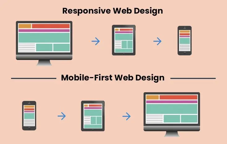
Many Indian web designers and business owners confuse “mobile-responsive” with “mobile-first.” They are fundamentally different design approaches. A mobile-responsive website is designed for desktop and then adapted to fit smaller screens using CSS breakpoints. A mobile-first website is designed for the smallest screen first, then progressively enhanced for larger screens. The difference in user experience is significant: mobile-first sites are inherently more optimised for touch navigation, fast loading on mobile connections, and thumb-reachable interface elements because mobile was the starting point, not an afterthought.
What Mobile-First Web Design Looks Like in India
- Touch-friendly tap targets: All buttons, links, and interactive elements must be at least 44×44 pixels to be comfortably tappable without precision. Many Indian websites have tiny navigation links that are virtually impossible to tap accurately on a smartphone.
- Single-column layouts: The primary content flow should be a single readable column on mobile, not multiple columns that squeeze illegibly on small screens.
- Optimised for 4G and variable connections: Indian mobile speeds vary dramatically, especially in Tier 2 and 3 cities. Mobile-first design means aggressive performance optimisation, including compressed images, lazy loading, and minimal JavaScript, so the site works well even on slower connections.
- Thumb zone design: The most important interface elements, the primary CTA, navigation, and contact buttons should be within comfortable thumb reach (the bottom 60% of the screen on standard smartphones). Navigation menus placed at the top of a mobile screen are out of thumb reach for most users.
- Minimal form fields: Indian mobile users abandon forms aggressively. Every form field that is not strictly necessary should be removed. Use phone number OTP verification instead of email-password registration where possible it reduces friction dramatically for the Indian market.
- WhatsApp integration: For Indian SMEs, a WhatsApp click-to-chat button is often more effective than a contact form. Indian users trust and prefer WhatsApp communication integrating it directly into the mobile website design is a conversion-rate multiplier.

Google’s Mobile-First Indexing: Since 2023, Google has been fully mobile-first indexed, meaning Google’s crawler primarily uses the mobile version of your website to determine its search ranking. If your mobile site is missing content, has poor performance, or provides a bad user experience, your search rankings suffer regardless of how excellent your desktop version is.
FAQ
What percentage of website traffic in India comes from mobile?
In 2026, approximately 76% of all web traffic in India originates from mobile devices. In Tier 2 and Tier 3 cities, mobile traffic represents 90% or more of total website visits, making mobile-first design absolutely essential for any Indian business targeting a broad national audience.
What is mobile-first indexing and how does it affect Indian websites?
Mobile-first indexing means Google uses your website’s mobile version as the primary basis for its search ranking decisions. If your website’s mobile experience is slower, has less content, or is harder to navigate than the desktop version, your search rankings will be negatively impacted directly reducing your organic traffic and leads.
Should Indian businesses add a WhatsApp button to their website?
Yes, strongly recommended. WhatsApp is India’s dominant communication platform, and a prominently placed WhatsApp click-to-chat button on your website — especially on mobile — typically delivers significantly higher enquiry rates than traditional contact forms. It aligns with the communication behaviour Indian users are most comfortable with.
Conclusion
In no other major economy does mobile-first web design matter more than in India. The sheer dominance of smartphone internet access, combined with Google’s mobile-first indexing, means that every Indian business website that is not genuinely designed mobile-first is operating with a significant, self-imposed handicap. we design every website with the Indian mobile user at the absolute centre of our process because that is where your audience actually is.